I have devoted all my previous articles to research, it is time to see if my conclusions are in line with the reality of everyday life. I have therefore decided to analyze all the interactions of my daily life in order to unearth those that are awkward, to study them, and to understand them.
Let’s take one of my typical days and start my analysis in the kitchen. This is the first space where I start my day and the one where I think I am most likely to find awkward interactions. My first action in the morning is to grab a bottle of milk from the fridge. A clumsy action and interaction that appears.
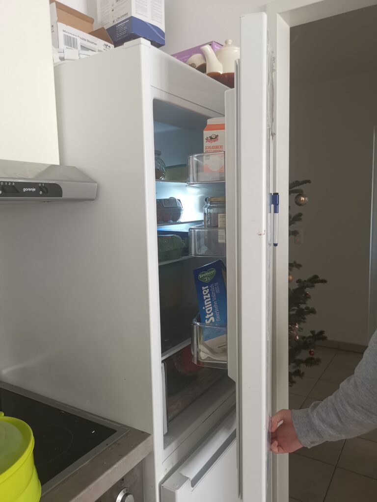
Refrigerator
The first awkward interaction of my day comes from my fridge and more specifically from the way I can open it. My fridge doesn’t have a handle, I’ve known that since I’ve had it, and yet I never tried to find out if there was a hidden handle and where it could be. I finally realized that the handle that had been created by the designers was a recess at the bottom, just above the freezer opening. I tried to open the door with this handle and soon realized that the location of the handle required a lot more effort. So the awkwardness comes from two things, first finding the handle was not easy because there was no indication and no meaning. Second, the location of the handle does not make it easy to open the door, which makes the interaction even more awkward.
hdrpl
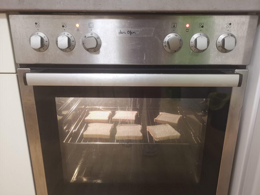
Oven
Right next to the fridge I can find the oven, connected to the hob. Its use is simple and the pictograms are all understandable. The problem I find with this oven comes from the indicator lights. One is accompanied by a pictogram related to the hob and the other to the oven. However, when the oven is activated the indicator light of the baking trays lights up, the one concerning the oven is even stranger, it lights up when I change the temperature, seeming to indicate when the oven has reached the temperature but never goes out. With this oven, it is therefore very complicated for me to establish when the oven is turned on and especially when it has reached the requested temperature, this is where the awkward interaction is.
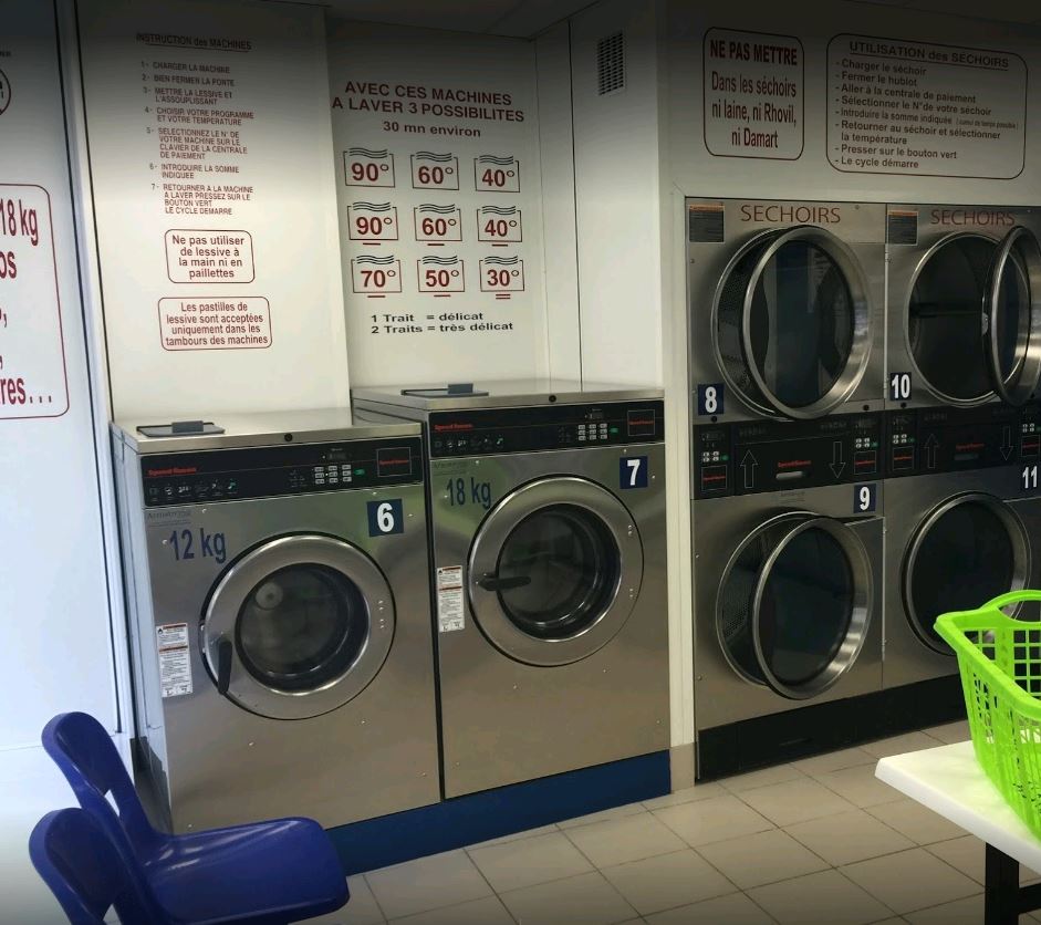
Washing Machine
My next clumsy interaction concerns my washing machine, it is composed of 4 buttons offering the following commands: fragile, color, cotton, normal. At first glance, the use seems simple, but as I don’t have the manual, I don’t know what each button corresponds to in terms of temperature and spin power. It is this lack of information that generates awkward interaction because every time I choose a program it seems to me to be a random choice. Here there is an object with buttons, therefore affordances, and annotations or signifiers, the problem lies in the understanding of these signifiers.
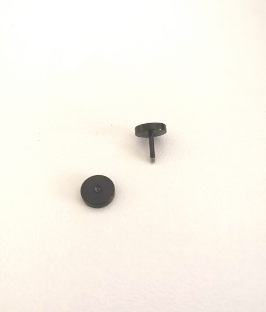
Earring
Another of the awkward interactions I may have had come from one of my earrings. I recently bought myself an earring, the saleswoman put it on without me looking at how the mechanism was made. When I got home I tried to take it off and realized that it didn’t work when I was pulling, so I figured it was an earring specific to the piercing store and I would have to go back and get it removed. It wasn’t until two days later that I realized that it was a screw earring and so I had to turn it around to get it removed. This awkward interaction is peculiar because its source comes from the fact that I didn’t see the person putting the earring on me, so I couldn’t have a conceptual model to understand how to remove it but also from my own knowledge because until then I didn’t know this type of clasp and therefore I hadn’t tried to turn the earring because I didn’t see the need for it.
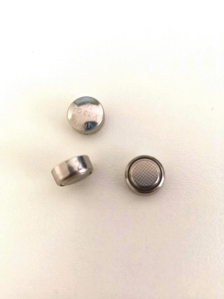
Piles
One of the awkward interactions of my day was with a simple object that we all know: batteries. They come in all shapes and sizes, and the ones I’m interested in are the smallest ones that are round. The awkward interaction with batteries is quite obvious, it knows which way we’re going to put them, where is the least, and where are the most. What I find particularly complex with batteries is that it’s an object that needs a lot of meaning. You need both 2 signifiers on the stacks to understand where is the least and where is the most, and you also need these same signifiers on the object that will contain the stacks in order to understand in which direction to put them. The peculiarity of small batteries is that the sign is complicated to read, it is only indicated on one side, and moreover when handling them if we touch both sides at the same time, with our fingers, we risk to discharge them. And all this information is not easy to find.
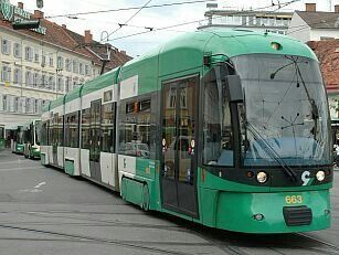
The tramway
Finally, let’s leave my apartment and take the streetcar. Being used to Parisian public transportation, I didn’t expect to be confronted with a clumsy interaction in the Graz streetcar. Indeed, Parisian transports have a wide variety of door openings ranging from the manipulation of a handle to an automatic opening, with no action to perform. I must confess that I did not understand what triggers the opening of the Graz streetcar door between the automatic opening and the action of pressing the door button. Here I may not have had the codes to understand what triggers this opening.
I have just described 6 clumsy interactions that populate my daily life but I am sure that there are still others that I have not yet spotted.
This intensive research on the objects that surround me, has allowed me to reflect on my way of perceiving them, and the importance that awkward interactions have in my daily life. It made me realize one thing, these clumsinesses have been there for a long time but I only started to notice them when I looked for them. Why wasn’t I curious about these objects earlier?