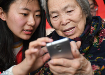
Population aging is taking place in nearly all of the countries around the world. Technologies and users change, which leads to some well-trained users in the digital environment. Metaphors are no longer needed to use or understand the icons, also the relation of a mapped object to its counterpart in the physical world is no longer necessary for the younger generation. As an increasing number of the elderly has moved from simple cell phones to smartphones, the industry sees this as an opportunity to create a new market segment. The smartphone industry becomes more competitive than ever before, and therefore studies on the elderly users are highly demanding.
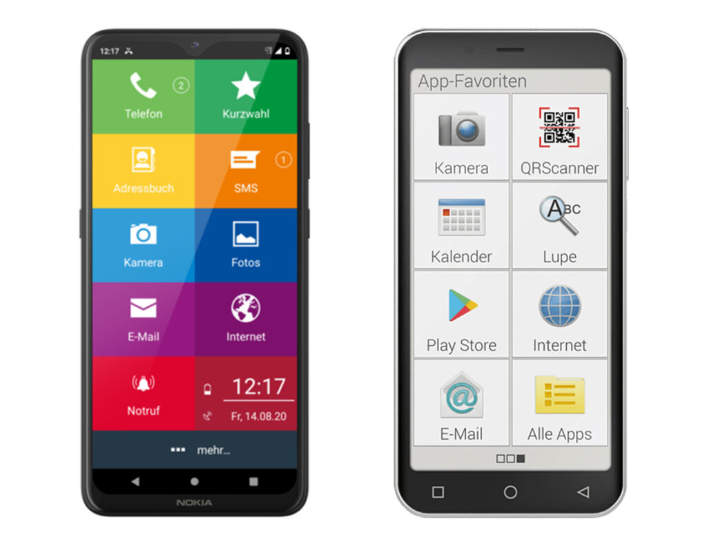
There are already graphic user interfaces (GUIs) that are especially designed for the elder generation. But the layout design is much bigger, simpler and not very appealing, transferring the message that the elderly are not capable to use smartphones.
To support such deficiency, it should be approached in a more positive way to gain trust in technology and above all also emotional satisfaction. Particularly for the elderly who start using the smartphones in their later years, an intuitive graphical guide is indispensable.
To understand what a GUI for the older generation of smartphone users should look like and how it can be used better, I looked at two studies that were conducted 5 years apart, one in 2015 and one in 2020 in Asia. These studies both deal with icon design and draw a connection to seniors’ preferences for skeuomorphic and/or flat design and show the different perceptions from designers and actual users.
When Apple released iOS7, it set off a graphical style trend moving from skeuomorphic to a simpler flat design. How to manipulate the degree of realistic appeal strongly influenced the identity of GUI design. To trace how GUIs changed from skeuomorphic to flat icon design, I looked at the IOS apps icons evolution, where the development is very clearly visible.
The Elders Preference for Skeuomorphism as App Icon Style (2015, Korea)
In a Korean study of 2015 researchers from the department of industrial design explored the value of skeuomorphism as an icon style particularly for the elderly people. For this study the researchers visited two senior centers in South Korea and recruited 38 participants ranging from 65 to 91 years. To identify the proper approach of skeuomorphism, they articulated two factors such as degree of realism and level abstraction.
The researchers identified what appeals more to the elderly smartphone users, particularly focusing on comparing the effects of skeuomorphism and minimalism. They picked Call, Contact and Camera icons in four different degrees of realism and metaphoric function each, in collaboration with designers. The first results were three tables and each displays the eight types of each Call, Contact and Camera icons according to the two abstraction levels and four degrees of realism. Considering the nature of elderly responses to the stimuli, the researchers planned a pairwise comparison to minimize cognitive workload. 84 cards with icons to compare were created and shown to the seniors. The first question the researchers asked was: „Which one looks better?“ (preference) followed by: „Which one do you think would perform the given feature?” (understandability).
The evaluation revealed that in deciding the preference for an icon, the degree of realism had twice the influence of the degree of abstraction. In particular, there was a positive correlation between the degree of realism and the preference. Regarding the degree of abstraction, the metaphorical style was preferred. Similarly, there was a positive correlation between degree of realism and understandability. Also the elderly considered the metaphoric style being better for understanding the meaning of an icon.
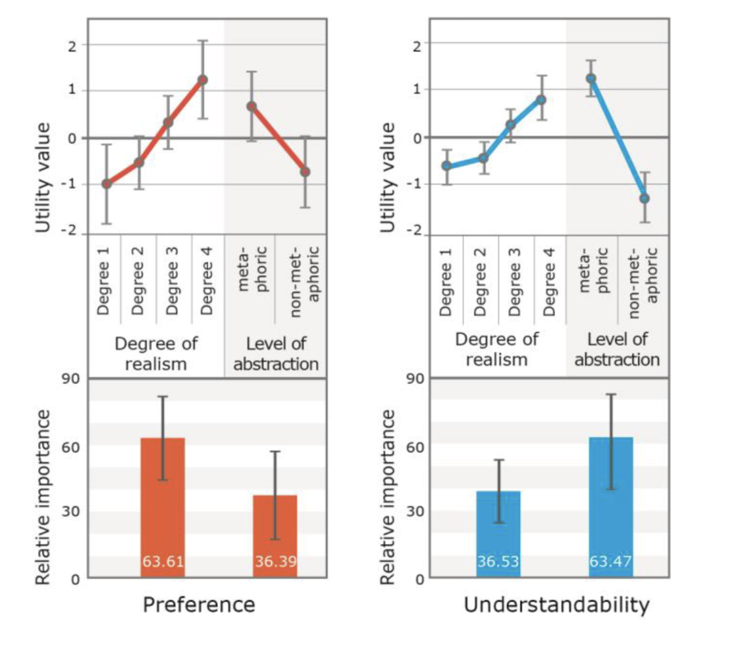
In conclusion, using the same metaphor from the real world has influence on the elders’ understandability, while illustrative and realistic representations play an important role on the elder preference. The elderly seem to prefer familiar expressions that look realistic, but still might need a cue to guess the function. In addition, this result indicate that there is a contradiction between actual usability and emotional judgment. It is expected for services targeting elderly users to depict an icon rather realistic and skeuomorphic than flat and abstract.
Skeuomorphic or flat icons for an efficient visual search by younger and older adults (2020, China)
In a Chinese study of 2020 three researchers from the department of industrial design investigated whether older or younger users perceive the aesthetics of icon styles in the same manner as designers and which style is preferred by which user age group. It also examines whether skeuomorphic or flat design is more suitable for the elder generation. The goal of this study was to help designers to find a suitable design style for people of all ages. There were 48 participants in total, 24 over the age of 60 (on average at the age of 72) 24 on average at the age of 23 years.
More than 97.8 million Internet users aged above 60 in China have installed an average of 28 applications on their smartphones. Icon images are intended to capture the user’s attention and thus play an essential role in target application searches. Nowadays, the trend of skeuomorphism in app icon design is giving way to flat design. But there is also a new design style evolving, which is called flat 2.0. This design type is almost flat but uses subtle 3D effects. The study emphasizes, that what the designer stresses is not always what the user notices or interprets. Sometimes user and designer have completely different perceptions. Examining this gap could help to reflect the role of this particular design elements.
Relating to previously created work in this sector, the researchers reflect that in terms of user experience and usability, younger adults prefer flat icon to skeuomorphism icon design. This has to do with the aesthetic and emotional satisfaction. The results from the older adults were the other way around. For the experiment, it was also important what kind of education, gender and level of smartphone usage the participants had.
The experiment started with a first task, where the participants had to rank the 72 shown icons with stars between flat or skeuomorphic impression. The second task was to click the icon that they considered to match the function name as fast and accurate as possible. The third task was to rate the perceived beauty of the flat and skeuomorphic icons on a scale.
The results imply that the younger participants could use the skeuomorphic icons more efficiently than they could use the flat icons and that they had an advantage over older participants in terms of this ability; however, aesthetically they appreciated flat icons more. In contrast, older participants searched skeuomorphic icons more quickly and accurately than they did flat icons, and aesthetically they appreciated skeuomorphic icons more.
Sources:
The Elders Preference for Skeuomorphism as App Icon Style (2015, Korea):
https://www.researchgate.net/publication/278670888
Skeuomorphic or flat icons for an efficient visual search by younger and older adults (2020, China): https://www.researchgate.net/publication/339984530_Skeuomorphic_or_flat_icons_for_an_efficient_visual_search_by_younger_and_older_adults
Featured image:
https://www.chinadaily.com.cn/a/201811/25/WS5bf9e3aea310eff30328ad92.html
Einfachfon:
https://www.einfachfon.de/senioren/
Icon Evolution Overview (Original):
https://i.pinimg.com/originals/5f/40/07/5f40073450f05e7a1069b69df12624f1.jpg