Design Activism – Protests and famous symbols for activism

In design activism, the designer seeks to effect change on a critical issue. Even when you go on the streets to protest, you stand up for something to change the world a little bit for the better. You are part of a movement, that has the aim to shape social and political processes. 

A powerful tool in protest is art. It is used to make change happen. From hand-drawn posters to large-scale art installments, everything is used for protest art to draw even more attention to a topic. Especially in 2020, Protest Art was developing as a stand-out visual trend for 2020. From an ongoing global pandemic to a mounting demand for social justice, the stories of 2020 have been illustrated along the way with art that helps us understand — and calls for — momentous changes. But integrating art into protest is not a 2020 invention. Powerful symbols, posters with often very reduced designs and effective messages implemented in artistic form have long been part of protest.

Following I would like to present three amazing, well-known and strong symbols for activism and protest: 

The Raised Fist
https://www.shillingtoneducation.com/blog/activism-design/

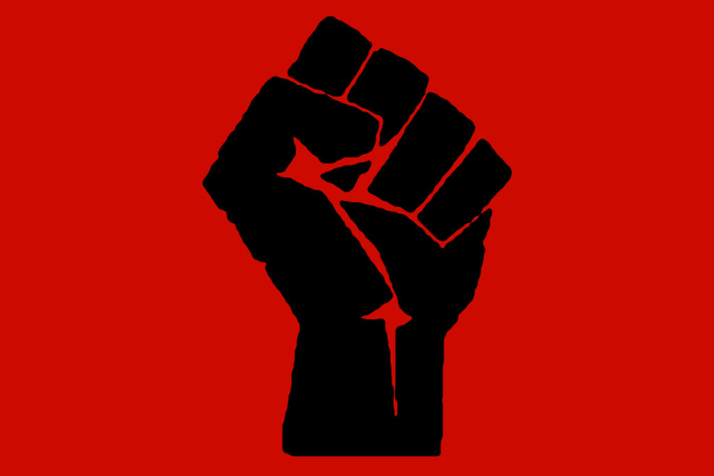
The Raised Fist is a symbol of solidarity and one of the most widely used graphic symbols in the world. It was first used by as the logo of the Industrial Workers of the World in 1917. In the Spanish Civil War, the symbol was popularized by the Republicans and has been copied by many different organisations and campaigns ever since. It has been used by Irish Republicans, Feminists and during the May ’68 uprisings in France. Probably the best known use of the Raised Fist is the Black Fist. It represents Black Nationalism or Socialism and was used widely by the Black Panther Party in 1960s’ USA. It is a global symbol of fighting oppression and it has a strong history. From1936, where a Parisian crowd demonstrates its support for the Popular Front, a coalition of socialists, communists, and other anti-fascist organizations, over members of the anti-Nazi Red Front Fighters, who gave the clenched fist salute in 1928 to black lives matter protest – there are a lot of examples for protest including the symbol of the raised fist. 


The Smiling Sun
https://www.shillingtoneducation.com/blog/activism-design/

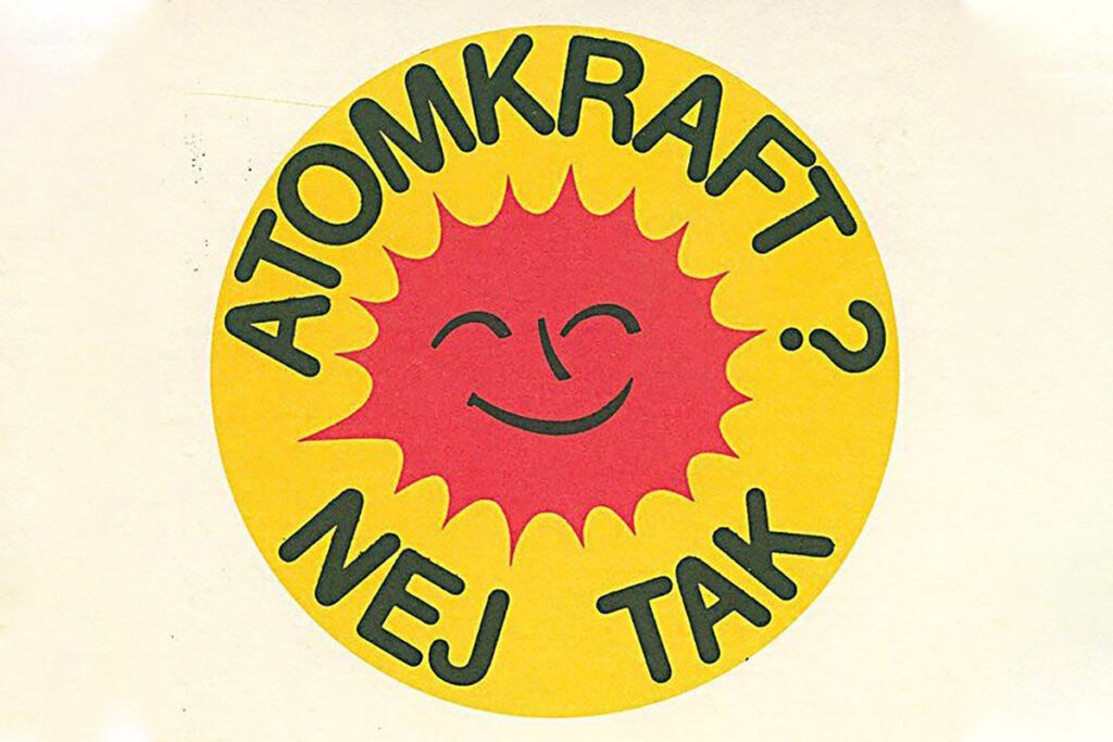
The Smiling Sun is a globally recognised symbol of the Anti-Nuclear movement. Today it is most known in the slogan as “Nuclear Power? No Thanks” but it was actually originally Danish: “Atomkraft? Nej Tak”. In fact, the symbol was originally a badge designed by 21 year old Danish activist Anne Lund. Lund belonged to the organisation OOA (In English: Organisation for Information on Nuclear Power).

The special thing about the icon is that it is non-confrontational. It’s friendly appearance combined with its polite but firm questioning calls for communication by dialogue. This badge has been produced in 45 different regional and national languages. Over 20 million have been produced and distributed worldwide.


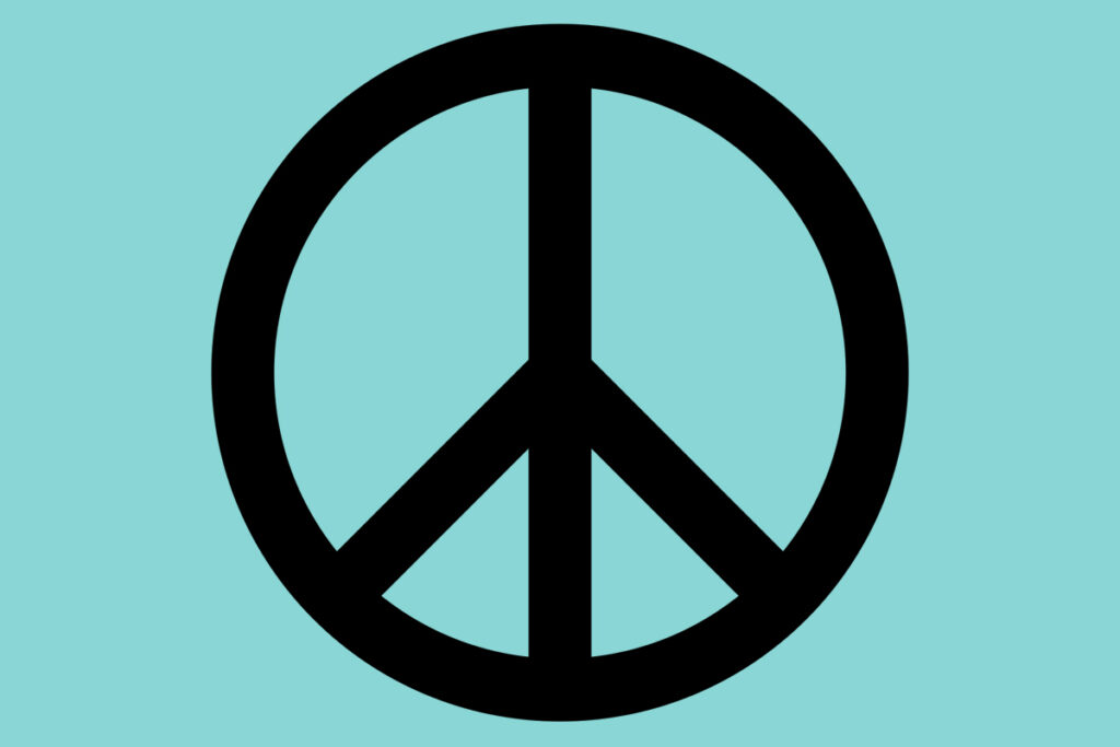
The Peace Symbol 
https://www.shillingtoneducation.com/blog/activism-design/

The Peace symbol can be definitely seen as one of the most famous symbols worldwide. It was designed by British designer Gerald Holtom as a logo for Nuclear Disarmament. Soon after its release in 1958 it became the official logo for the British Campaign for Nuclear Disarmament (CND). It was first used in the march to the Atomic Weapons Research Establishment at Aldermaston, England. Holtom began with Nuclear Disarmament, ND for short, and then took the semaphore signals for those two letters. He combined the symbols, added a ring, and ended up with one of the most well-known icons of our time.
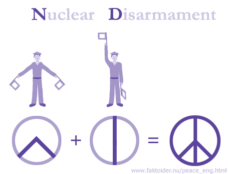
The logo was never copyrighted and in the decade after its introduction became the general purpose peace symbol we know it as today.
Design Activism – Good news for the planet

„If things are bad, that’s good.” – Bruce Mau

Because when things are bad, then people seek a solution. And this is especially true for designers, who feel the urge and obligation to take action and find a solution when complex problems arise. 
Above all, things are really bad when we have a look at climate change. Fortunately, there are designers out there, who take their responsibility to make an impact and develop solutions for the good.

In this blog post I want to introduce a few innovative projects for climate action. The platform “WHAT DESIGN CAN DO”, which has already published several books and articles on the subject, presents various brilliant ideas in its book “Good news for the planet. 31 brilliant ideas for climate action.”. The aim of this publication is to raise awareness for climate action, adapting to the consequences of change, and mitigating the causes. The following are examples which are illustrating the power of design to bring about change. 

01: Plastic waste can be made prettier 

Project: Pretty Plastic Planet
By: Reinder Bakker, Hester van Dijk and Peter van Assche, Designstudio’s Overtreders W
and bureau SLA 
Country: Netherlands
Discipline: Product Design, architecture
The Story of Pretty Plastic – from waste to resource: How it started

The first project, which the designers Reinder Bakker, Hester van Dijk and Peter van Assche from the designstudio’s bureau SLA and Overtreders W did together, was a café in an Amsterdam park called, Noorderpark, where all the materials were bought second-hand on the internet. 

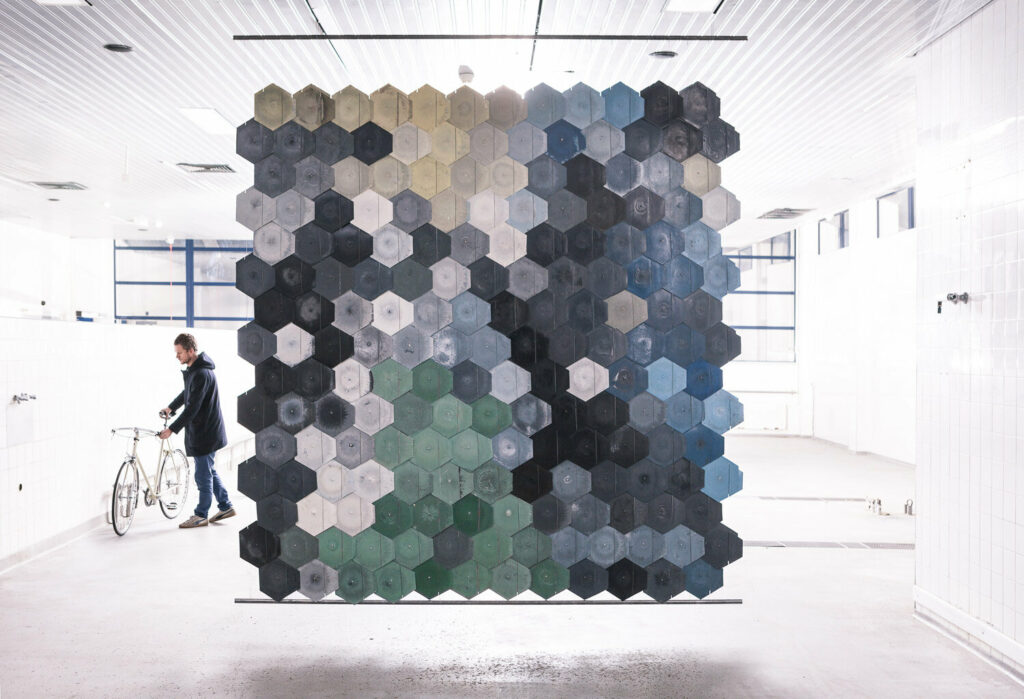
Another co-production of the collaborating designers is a self -built Pretty Plastic Plant with idea of upcycle plastic waste. It started when they got hold of a shipping container full of household plastic garbage, where they immediately knew that this is more than just waste. They saw the potential of a beautiful building material and designed a tile from upcycled plastic. The designers visited the best plastic product producers in the Netherlands to present their design of the building tile, but there was only little interest.
To prove that plastic upcycling can be competitive and have identity and character they designed and built their own machine park – the Pretty Plastic Plant. Their solution is simple: sorting plastic household waste carefully by type and color before it is processed, it can become to a stronger and brighter result than the original product. Anyone who brings their plastic garbage to this hands-on recycling site can witness the whole transformation process from scrap to product.

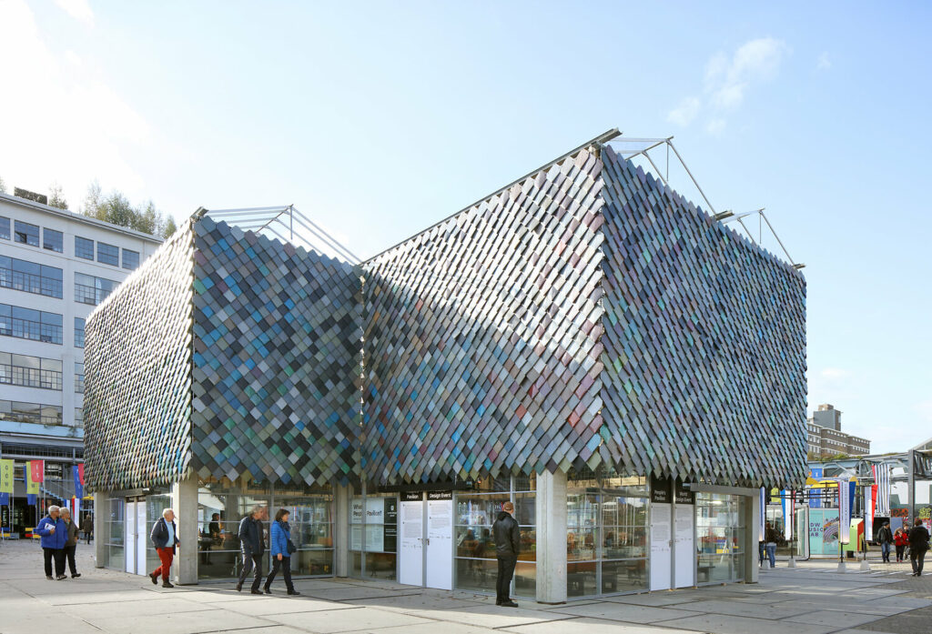
For different interior design projects, the Pretty Plastic Plant produced more than a thousand unique tiles, what led to a n even greater project. In 2017, they designed the cladding of the facade of the main pavilion for the Dutch Design Week, the People’s Pavilion. It consisted of 9.000 unique plastic upcycled tiles, all made from resident’s household plastic waste. After that, the Belgium recycling company Govaplast became Pretty Plastic’s production partner and engineered the production.

Temporary recycling architecture: The People’s Pavillon in Eindhoven

Since 2019, Pretty Plastic tiles can be applied onto any building. In January 2020, the first new building with cladding of Pretty Plastic tiles was delivered. 

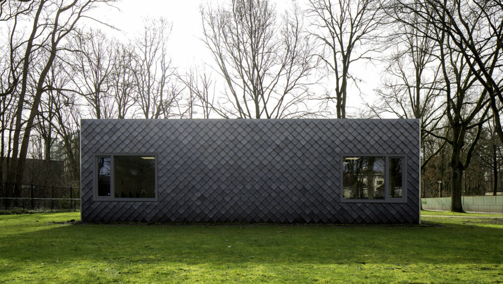
Sint Oelbert School in Oosterhout with cladding of Pretty Plastic tiles

02: Crazy Experiment to sway investors 

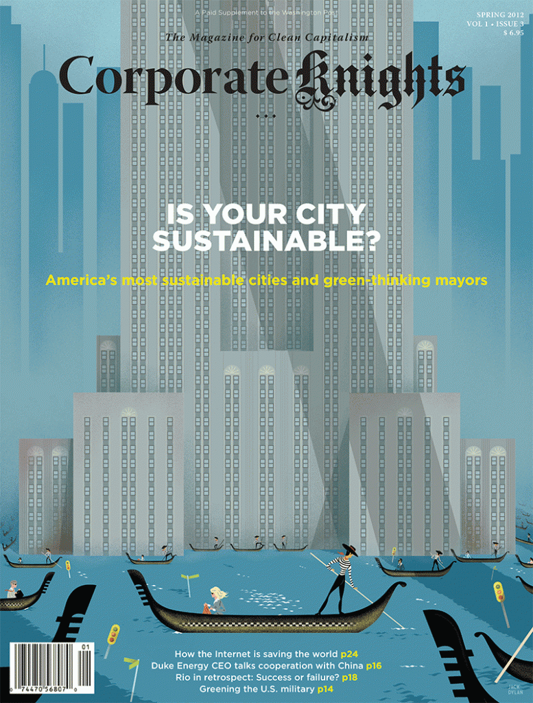
Corporate Knights – The Voice for Clean Capitalism 

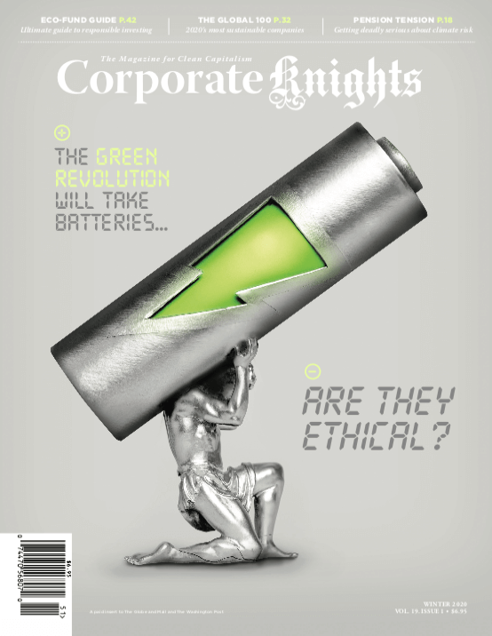
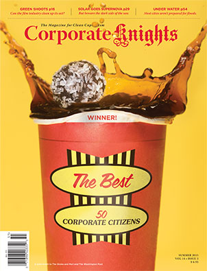
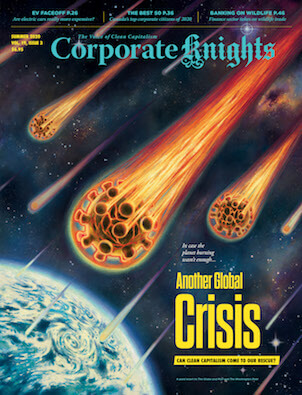
Toby Heaps’ mission is to push companies to adopt more environmentally conscious practices. He is founder and CEO of Corporate Knights, which is a media and research company in Toronto founded in 2002. One of his tools is the Magazine for Clean Capitalism `Corporate Knights`, distributed quarterly as an insert in the Globe and Mail and Washington Post

Heaps sees ‘Corporate Knights’ as kind of a crazy experiment to see if it makes a difference and people will start to take better decisions when the right information is getting into the right people’s hands. Since 2005, the magazine is ranking the world’s 100 most sustainable companies as key strategy in shaping corporate culture. Today, ‘Corporate Knights’ is also known as a lobby group and a platform for such initiatives as the Council for Clean Capitalism, a multi-industry group of leading Canadian companies dedicated to advocating economic and social policy changes that reward responsible corporate behaviour and remove barriers to clean capitalism.

The vision of Corporate Knights is to provide information empowering markets to foster a better world. As one of the world’s largest circulation magazines focused on the intersection of business and sustainability, Corporate Knights is the most prominent brand in the clean capitalism media space. It is also the first print business magazine and research firm in the world to be a Certified B Corp. B Corps must meet rigorous standards of social and environmental performance, accountability and transparency. As an example, their website is powered by 100% renewable electricity from Canada.

03: Do for Nature what you did for Clients

“[…] If creative communications have persuaded us to consume in a way that impacts our planet for the worse, then it can be used to inspire us to try out things that have a more positive impact on the environment.”

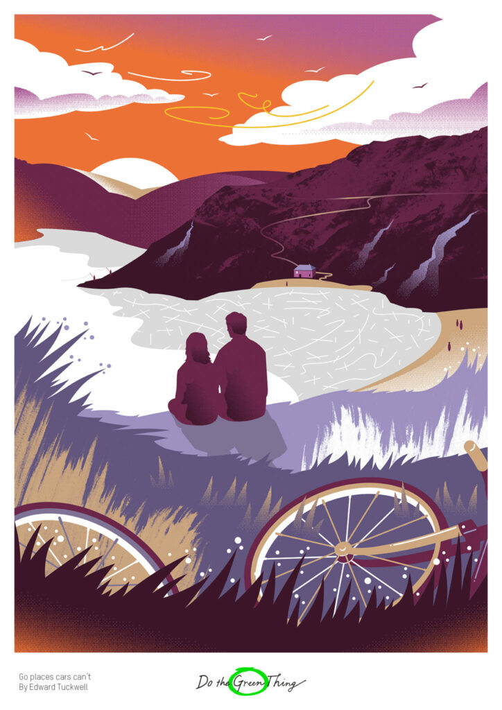
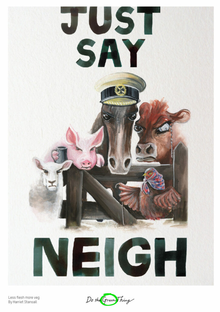
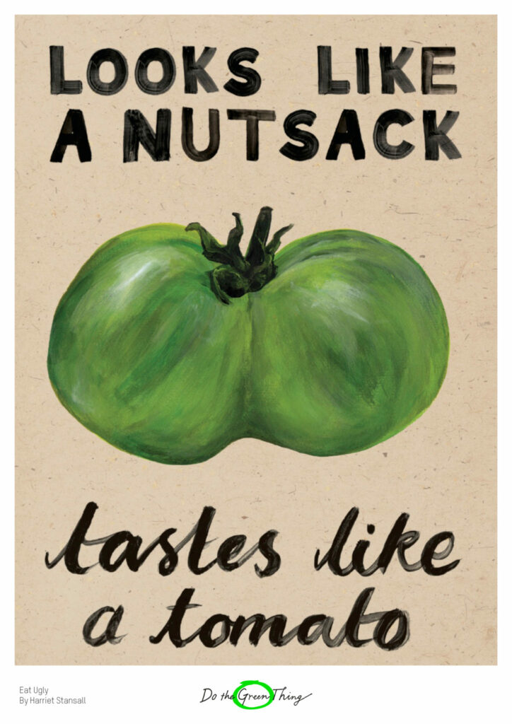
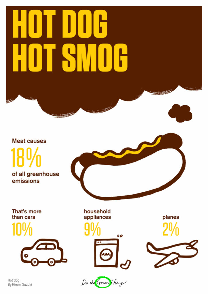
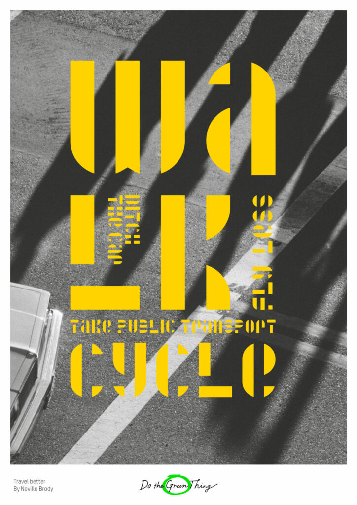
This is what the online platform ‘Do the Green Thing’ by communication experts Andy Hobsbawm and Naresh Ramchandani stands for. They call for designers to get creative against climate change. The platform offers designers a chance to make a change for the world by doing the thing they do best – to get a message across to the public. Whether graphic designer, copywriter, animator, art director or photographer, everybody is invited being part of Doing the Green Thing. The aim is to use the power of creative work to make people pause, smile, think and act. Already more than 500 creatives contributed to this campaign by making films, posters, podcasts and products. 

With Do the Green Thing everybody has the chance to play one’s professional part in saving the planet. It is a public service for the planet that uses creativity to tackle climate change. More than 45 million people have been inspired to live more sustainably.