Artificial intelligence as a design tool

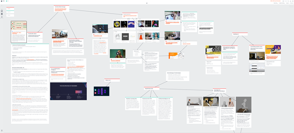
For the research on the field of artificial intelligence I collected lots of information from different websites and videos. In the beginning I had problems to gather everything in a nice manner. Positioning images in a Microsoft word document seems like an undoable task. Pen and paper didn’t allow me to copy and paste anything. With Indesign I started layouting stuff which didn’t need a layout. After trying out some tools and being frustrated with the restrictions, I was searching for a tool which could help me to save links and videos, structure information, add text, thoughts and images. It should be easy to use in the process and the output should look appealing without too much design effort. After trying out some online note-tools, I found Milanote [1]. You can have a look at my collection to see more examples for AI driven designs and articles [11]. Milanote is a free online tool for organizing creative projects. It shall help gathering information and structuring it however its desired. I fell in love instantly.

The tool Milanote helped me to structure notes and gather all different kinds of information. View the whole collection at [11]

There is a lot to know about the typology, methods and kinds of AI. In the last blogpost I already explained the difference between machine learning, artificial intelligence and neural networks. The AI systems we know today are based on machine learning. How a simple machine learning algorithm works is not too difficult to understand. There are tons of YouTube videos which explain the basics, I recommend the video of 3Blue1Brown [2] because of it’s visual explanation. But anything will do.

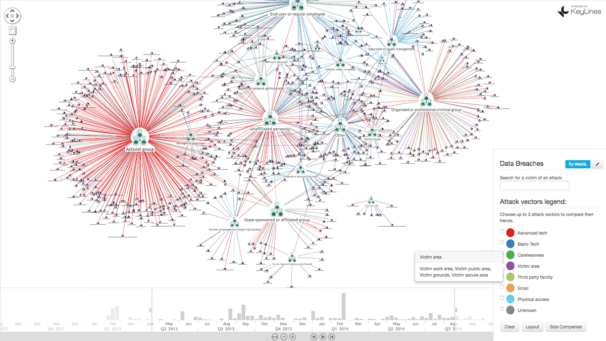
I took a closer look at how I could use artificial intelligence in my own field of interest. As an interaction designer, there are many intersections where AI can help to create. I came across the website of Google AI experiments [3] where different AI projects are shared. “AI Experiments is a showcase for simple experiments that make it easier for anyone to start exploring machine learning, through pictures, drawings, language, music, and more.” It says on the website. It’s collection of work from Google teams and other creative teams in different fields which used AI to find a solution to problem. You find AI examples for learning, drawing, writing, music and other experiments. Just the shear sum of creative work built with AI struck me.

I was especially impressed by the “teachable machine” by the Google Creative Lab [6]. They invented a free online tool, where you can build your own machine learning model in such an easy way… to be honest- it feels somehow rude how easy this tool makes machine learning seem. The video was very inspiring, showing all kinds of solutions and ideas built with pattern recognition. I think this is a huge step in the development of AI and machine learning. I tried the tool if it can spot if I’m wearing glasses or not. First you need to gather pictures of what the method shall recognize. Taking a few selfies of myself wasn’t too difficult. Secondly, by just clicking a button (yes just clicking a button!!) you can train your model and boom that’s all.

The teachable machine makes machine learning crazy easy to non-programmers

This opens up a whole new world to non-programmers and will allow thousands of creative people stepping into the field of machine learning/AI. I have the feeling that using this online tool for a own project might still be more difficult that it seems in the first place, since you need to set up the communication between your model and your code, but still- I’m impressed. Furthermore, this new technique of collecting data of an object opens up a whole new perspective. One of the annoying parts of training a machine learning code was, that you had to feed the model with tagged data. We all know those reCAPTCHA pictures from Google, where you need to click on the pictures which show traffic lights, cars, busses, road signs and stuff like that. What we are doing there is not only a proof for a login, but we are actually feeding and AI with very precious information [4]. (I sometimes click on the wrong images on purpose to confuse Google)

Furthermore, I made a list of how AI could be used in our field of work. This collection is driven a lot by which technologies we used in our first semester.

  1. Use pattern recognition and build physical systems with Arduino
    – Use an Arduino to build a hardware solution where physical things are triggered.
    – Get the input of an event via image (computer vision) or via sound.
    – React to that event with your Arduino device.
    – Example: showed in the video of the teachable machine [5]. Could be used to switch on a light of a disabled, open the little door when the system sees the dog approaching, sort trash by filming the trash etc.
  2. Use pattern recognition to control an object in virtual space
    – Use Unity to control an object in a virtual space.
    – Can track hand gestures or body movement to navigate or manipulate within a virtual 2D or 3D space.

    – Can use for interactive applications in exhibitions
    2.1 The more neural activity your brain has, the more likely you will remember something. If you get the body to move, you can trigger the muscle memory and the user might find it easier to remember your content. For example: teach music theory not only with information or sound but using the gap between your fingers to visualize harmony theory.
    2.2 A higher immersion can lead to more empathy. For example if you made the experience of being an animal in a burning jungle with virtual reality for instance, you might feel more empathy for this concern. A lived experience is more likely to influence emotionally rather than just telling a person that animals are dying in fire.
  3. Draw images with sound
    – Create “random” images which are drawn by incidents in the real world.
    – For the implementation you could use processing or p5.
    – Example: you could record with your Webcam, film the street and trigger an event when a blue car is driving by. This could change how a picture is drawn by code. You could also use certain sounds instead.
  4. Visualizing data
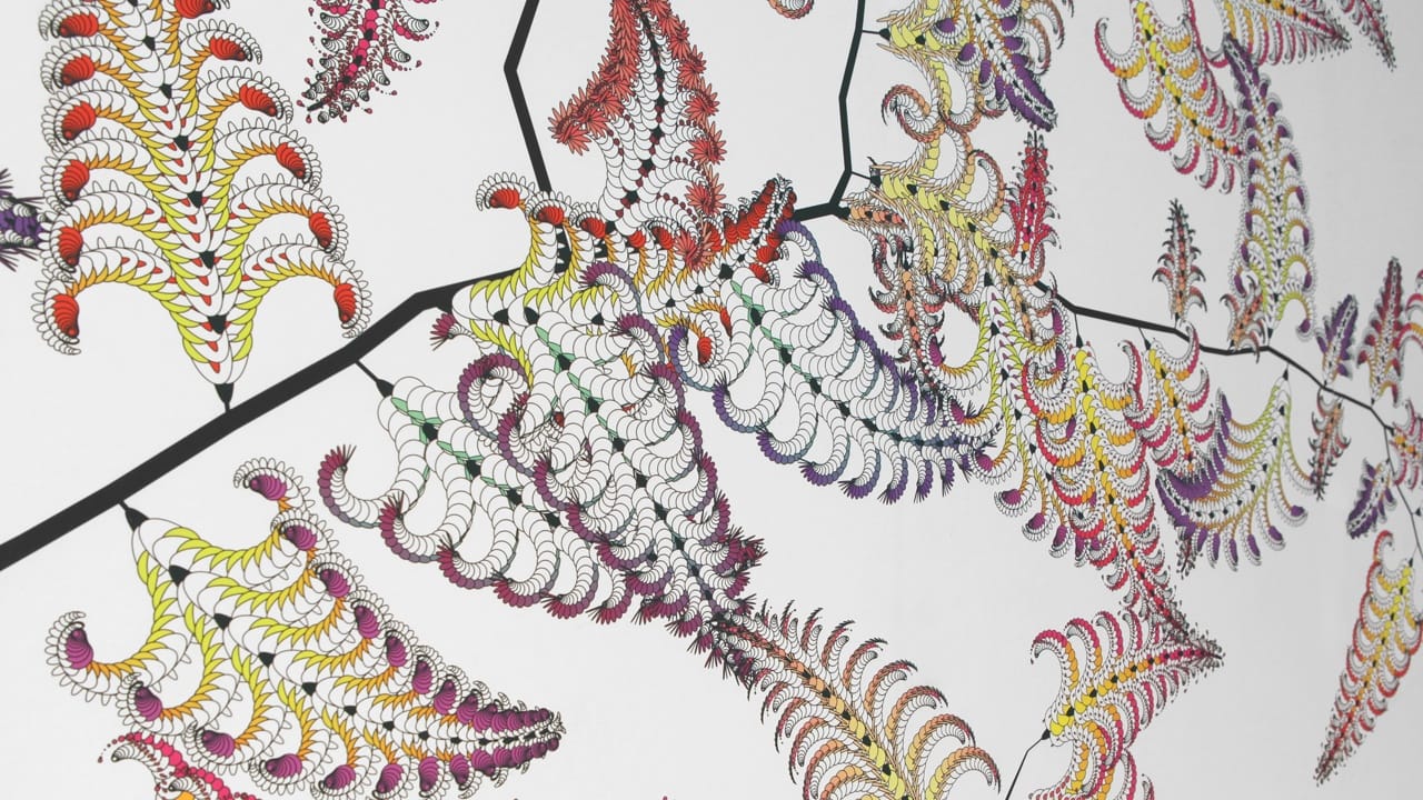
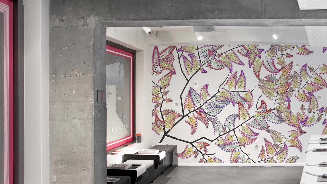
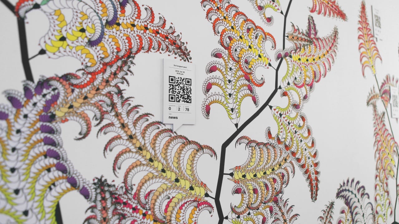
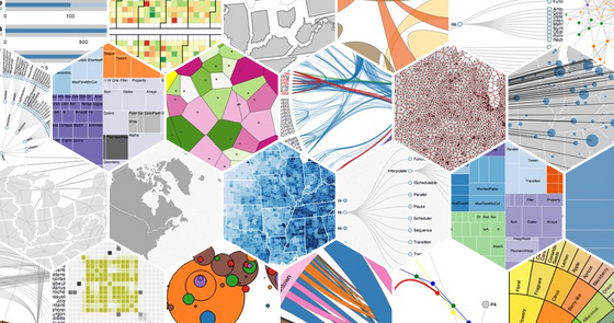
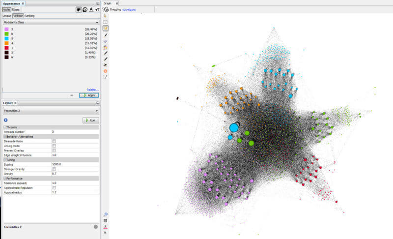
    – Collect data and visualize it in images or in a virtual space.
    – Huge amounts of data can be classified and structured by machine learning to create strong Infographics.
    – Data can be very powerful and reveal insights which you wouldn’t think of. There are good examples where well-structured meta data showed coherences, which didn’t seem related to the data itself. An episode of the design podcast 99% invisible talked about how a list of e-mails within a company showed information of who is a manager and who was probably dealing with illegal and secret projects – without reading one e-mail [7]. Moreover, David Kriesel gives with his presentations an impression of how powerful meta data is [8]. With the power of machine learning and AI we could reveal information which don’t seem obvious in the first place.
    – Example:
    https://experiments.withgoogle.com/visualizing-high-dimensional-space
  5. UI design, recommendations and personalization
    – Use machine learning (ML) in your UI to make navigation easier and quicker.
    – Personalize systems for your user and create experiences where the user can move freely within your application

    – Best practice found in article [9]:
    5.1. Count decisions as navigation steps
    Count how many decisions need to be made for navigating though system. Reduce them with ML. The ML-generated suggestions shouldn’t make the user evaluate the options, otherwise the ML doesn’t make any sense here.
    5.2. A predictable UI is necessary when the stakes are high
    Do not use ML for critic navigation/finding. Human works best in such cases. Consider using it for browsing and exploration.
    5.3. Be predictably unpredictable
    Basically, hide the new ML feature. Think it depends on use case.
    5.4. Make failure your baseline
    ML will make mistakes. Built the system that if mistakes happen, it doesnt take longer to erase them rather than just doing the job on your own in the first place.
  6. Use AI for creative exchange
    – Use AI as a communication in creating new concepts.
    – AI is good in making links and connections to similar fields. Also, it’s good at bringing randomness into the game.
    – Example of writers which chat with AI to boost their ideas. Since ai is built with a neural network its kind of works like our brain, so it’s capable of bringing fascinating ideas for the field it’s programmed for. And since it’s a machine and not a human it can bring new perspectives into thinking (see youtube “Prescursors to a Digital Muse” below).
    – Example: The AI for the game GO, played a move which seemed like a bad one to a human but maximized the winning probability since it was interested in winning the whole game and not conquering as many fields as possible. Professional GO players examined the new thinking of the game which is played since the 4th century, with a new perspective [10].
  7. Get rid of repetitive tasks
    I was so fascinated when I saw how the new iPhone does all the photo editing which I used to do in hours of work, automatically. Of course, it does mistakes and is not as accurate, but come on, who enjoys cropping of a curly haired person in Photoshop. Using a cropped image and putting it somewhere else is the fun part, not the cutting out. At least for me. When such tasks are done by a machine, we can concentrate on all the other ideas we have with that curly-haired-person-image.
Example video for 6. Use AI for creative exchange.

On the search on where AI is and where designers are, you could often read about the fear that AI will take away the jobs of designers. Since AI is capable of doing a lot of work which was dedicated to designers for a long time, it’s definitely true in some ways. But we need to evolve and adapt to technology. A lot of frustrating and repetitive tasks can be done by the machine, take advantage of this and start creating from that point. We can create much larger scaled projects when we can deal with such technologies.

  1. Free tool for collecting notes and structuring ideas:
    https://milanote.com/
  2. Machine Learning tutorial:
    https://www.youtube.com/watch?v=aircAruvnKk&t=3s&ab_channel=3Blue1Brown
  3. Google AI experiments:
    https://experiments.withgoogle.com/collection/ai
  4. Article on how recaptcha images help Googles algorithms:
    https://medium.com/@thenextcorner/you-are-helping-google-ai-image-recognition-b24d89372b7e
  5. The teachable machine promotion video:
    https://www.youtube.com/watch?v=T2qQGqZxkD0&feature=emb_logo&ab_channel=Google
  6. The teachable machine website:
    https://teachablemachine.withgoogle.com/
  7. Interesting podcast – the value of data:
    https://99percentinvisible.org/episode/youve-got-enron-mail/
  8. Interesting presentation on the power of data mining:
    https://www.youtube.com/watch?v=-YpwsdRKt8Q&t=2800s&ab_channel=media.ccc.de
  9. AI in UI design
    https://design.google/library/predictably-smart/
  10. Documentary of the Alpha Go AI
    https://www.youtube.com/watch?v=WXuK6gekU1Y&ab_channel=DeepMind
  11. Collection of articles, example videos and background information
    https://app.milanote.com/1KX8J41TAgBr12?p=d7PvzxFcpuX

DATA, code, design | Abstrakte Daten-Visualisierung

Ab wann spricht man von abstrakter Daten-Visualisierung?

Um Daten-Visualisierungen, Diagramme, Infografiken etc. „lesen“ zu können, ist es wichtig, dass diese leicht verständlich aufgebaut und visualisiert sind. Hierbei spielt der informative Wert die Hauptrolle, der visuelle Anspruch rückt dabei in den Hintergrund und soll nur die Informationsaufnahme unterstreichen.

Onformative, ein Berliner Studio für digital art and design, zeigt (meiner Interpretation zufolge) ein sehr schönes Projekt für abstrakte Daten-Visualisierung mit dem „4010 Facebook Tree“.
Für dieses Projekt wurden Facebook-Beiträge, des Auftraggebers Telekom flagship store, über vier Jahre verarbeitet und mittels Processing visualisiert. Der 4010 Facebook Tree verarbeitet Interaktionen eines Facebook-Posts, wie Like-Anzahl, Type des Posts, Comment-Anzahl etc. und illustriert diese als organischen Baum/Farn.

From onformative | 4010 Facebook Tree

Ohne Kontext wirkt diese Illustration sehr komplex und detailreich. Erfährt man die generativen/algorithmischen Regeln dahinter, so ist man in der Lage, diesen Baum auf weitere Ebenen zu entschlüsseln und zu entdecken. Damit unterscheidet sich der Anspruch dieser „data illustration“ von jenem der klassischen Daten-Visualisierung insofern, dass hier der visuelle Teil eine viel höhere Wertigkeit besitzt als die Informationsaufnahme.

Mittels angebrachten QR Codes können LeserInnen den Spalt zwischen Information und Grafik schließen und können die dahinter verarbeiteten Daten eruieren und werden direkt zum Facebook-Post geleitet.

Source

https://onformative.com/
https://onformative.com/work/4010-facebook-tree/

DATA, code, design | Daten

In unserer Zeit sind wir von Daten und Informationen umgeben. Rund um die Uhr werden in jeder Sekunde Daten generiert. Dies veranschaulicht der DOMO report aus dem Jahr 2018:

“Over 2.5 quintillion bytes of data are created every single day, and it’s only going to grow from there. By 2020, it’s estimated that 1.7MB of data will be created every second for every person on earth.”

Via socialmediatoday.com | DOMO, How much data is generated every minute?

Testdaten

Einer der wichtigsten Punkte der Daten-Visualisierung sind die Daten selbst. Um realistische Testdaten zu analysieren wurden folgende Seiten recherchiert:

THE WORLD BANK

Explore. Create. Share: Development Data

DataBank is an analysis and visualisation tool that contains collections of time series data on a variety of topics. You can create your own queries; generate tables, charts, and maps; and easily save, embed, and share them. Enjoy using DataBank and let us know what you think!

THE WORLD BANK bietet eine Vielzahl an Datenbanken und vorgefertigte Report Tools welche die Analyse erleichtern.

Beispiel:

https://databank.worldbank.org/source/gender-statistics

Google Datasetsearch

“Die Datensatzsuche soll Datensätze allgemein zugänglich und nutzbar machen und die folgenden Aufgaben erfüllen:

  • Sie soll ein System schaffen, das die Publisher geteilter Daten dazu motiviert, die Best Practices für Speicherung und Veröffentlichung von Daten anzuwenden
  • Sie soll Wissenschaftlern die Möglichkeit geben, anhand der Zitierung der von ihnen erstellten Datensätze zu zeigen, welche Wirkung ihre Arbeit hat

Da immer mehr Datensatz-Repositories schema.org und ähnliche Standards verwenden, um ihre Datensätze zu beschreiben, werden Nutzer im Laufe der Zeit in der Datensatzsuche zunehmend umfangreichere und vielfältigere Datensätze finden.”

https://datasetsearch.research.google.com/help

Source

https://www.socialmediatoday.com/user_media/diveimage/internet_minute_info2.jpg

https://datasetsearch.research.google.com/help

https://databank.worldbank.org/

DATA, code, design | Klassische Daten-Visualisierungs-Tools

Um Daten zu visualisieren gibt es verschiedene professionelle Tools. Diese werden, je nach Anforderungen kategorisiert. Diese sehr komplexen Tools bieten eine Vielzahl an Report und Visualisierungsmöglichkeiten.

  • Code Tools
  • Visual Reporting or BI
  • Maps
  • Infographic Tool
  • Net-work graphs
  • Large-Screen Visualization

Code Tools

D3.js

Open Source JavScript library mit verschiedenen Visualisierungsmöglichkeiten (HTML, CSS, SVG)

From finereport.com | D3.js

Plotly

From finereport.com | Plotly

gglot2

From finereport.com | ggplot2

Visual Reporting or BI 

Excel

From finereport.com | Excel

FineReport

From finereport.com | FineReport

Tableau

From finereport.com | Tableau

Maps

Leaflet

From finereport.com | Leaflet

Power Map

From support.microsoft.com | PowerMap
From finereport.com | PowerMap

Infographic Tools

Piktochart

From finereport.com | Piktochart

Visme

From finereport.com | visme

Net-work graphs 

Keylines

From finereport.com | Keylines

Gephi

From finereport.com | Gephi

Large-Screen Visualization

Ali DataV

From finereport.com | Ali DataV

Last but not least FineReport itself

From finereport.com | FineReport

Source

https://towardsdatascience.com/top-16-types-of-chart-in-data-visualization-196a76b54b62

DATA, code, design | Klassische Diagrammtypen

Wie schon im vorherigen Blogeintrag beschrieben gibt eine Vielzahl an Diagrammtypen. Manche sind sehr einfach gestaltet, andere wiederum sehr komplex. Jedoch spielt die Verständlichkeit dabei eine viel größere Rolle als Komplexität.

Hier 16 davon:

Column Chart

From towardsdatascience.com | FineReport

Bar Chart

From towardsdatascience.com | FineReport

Line Chart

From towardsdatascience.com | FineReport

Area Chart

From towardsdatascience.com | FineReport

Pie Chart

towardsdatascience.com | FineReport

Scatter Plot

From towardsdatascience.com | FineReport

Bubble Chart

From towardsdatascience.com | FineReport

Gauge

From towardsdatascience.com | FineReport

Radar Chart

From towardsdatascience.com | FineReport

Frame Diagram

From towardsdatascience.com| FineReport

Rectangular Tree Diagram

From towardsdatascience.com| FineReport

Funnel Chart

From towardsdatascience.com| FineReport

Word Cloud Chard

From towardsdatascience.com| FineReport

Gantt Chart

From towardsdatascience.com| FineReport

Regional Map

From towardsdatascience.com| FineReport

Point Map

From towardsdatascience.com| FineReport

Flow Map

From towardsdatascience.com| FineReport

Heatmap

From towardsdatascience.com| FineReport

Soure

https://towardsdatascience.com/top-16-types-of-chart-in-data-visualization-196a76b54b62

DATA, code, design | Daten-Visualisierung, Art + Science = ?

Definitionssuche

„Mit Visualisierung oder Veranschaulichung (Sichtbarmachen) meint man im Allgemeinen, abstrakte Daten (z. B. Texte) und Zusammenhänge in eine graphische bzw. visuell erfassbare Form zu bringen.“
https://de.wikipedia.org/wiki/Visualisierung

Data visualization (often abbreviated data viz[1]) is an interdisciplinary field that deals with the graphic representation of data. It is a particularly efficient way of communicating when the data is numerous as for example a Time Series. From an academic point of view, this representation can be considered as a mapping between the original data (usually numerical) and graphic elements (for example, lines or points in a chart). The mapping determines how the attributes of these elements vary according to the data. In this light, a bar chart is a mapping of the length of a bar to a magnitude of a variable. Since the graphic design of the mapping can adversely affect the readability of a chart,[2] mapping is a core competency of Data visualization. Data visualization has its roots in the field of Statistics and is therefore generally considered a branch of Descriptive Statistics. However, because both design skills and statistical and computing skills are required to visualize effectively, it is argued by some authors that it is both an Art and a Science.[3]
https://en.wikipedia.org/wiki/Data_visualization

Art + Science = Informationdesign?

Als Informations Designer und angehender Communication Designer trifft diese Definition den Nagel für mich auf den Kopf:

Information design is the practice of presenting information in a way that fosters an efficient and effective understanding of the information. The term has come to be used for a specific area of graphic design related to displaying information effectively, rather than just attractively or for artistic expression. Information design is closely related to the field of data visualization and is often taught as part of graphic design courses.[1] The broad applications of information design along with its close connections to other fields of design and communication practices have created some overlap in the definitions of communication design, data visualization, and information architecture.”
https://en.wikipedia.org/wiki/Information_design


Wenn man von solchen multidisziplinär erstellten Diagrammen spricht, spricht man meist von solchen:

  • Line chart  
  • Bar chart
  • Histogram
  • Scatterplot
  • Boxplot
  • Pareto chart
  • Pie chart
  • Area chart
  • Control chart
  • Run chart
  • Stem-and-leaf display
  • Cartogram
  • Small multiple
  • Sparkline
  • Table
  • Marimekko chart

Charles Joseph Minard

Wenn wir von Informationsgrafik sprechen wird oft auf den “Erfinder” Charles Joseph Minard (1781 – 1870) verwiesen. Minard gilt als „a cartographic pioneer in many respects“.

Bereits 1825 studierte Minard Passagierflüsse/Frachtflüsse im Schienenverkehr und hat hierzu Balkendiagramme angefertigt.

Minards erste statistische Grafik

1845 visualisierte Minard die erste und revolutionäre Flow-Map, welche von Edward Tufte als „vermutlich beste Infografik aller Zeiten“ bezeichnet wird. Sie zeigt den Straßenverkehr zwischen Dijon und Mulhouse.

Minards erste Flow-Grafik

Seine Infografik, später bekannt als Sankey diagram, zeigt Napoleons Russlandfeldzug 1812 in der „Carte figurative des pertes successives en hommes de l’Armée Française dans la campagne de Russie 1812–1813

“The original description in French accompanying the map translated to English:[5]
Figurative Map of the successive losses in men of the French Army in the Russian campaign 1812–1813.
Drawn by M. Minard, Inspector General of Bridges and Roads (retired). Paris, November 20, 1869.
The numbers of men present are represented by the widths of the colored zones at a rate of one millimeter for every ten thousand men; they are further written across the zones. The red designates the men who enter Russia, the black those who leave it. — The information which has served to draw up the map has been extracted from the works of M. M. Thiers, de Ségur, de Fezensac, de Chambray and the unpublished diary of Jacob, the pharmacist of the Army since October 28th.

In order to better judge with the eye the diminution of the army, I have assumed that the troops of Prince Jérôme and of Marshal Davout, who had been detached at Minsk and Mogilev and have rejoined near Orsha and Vitebsk, had always marched with the army.“
https://en.wikipedia.org/wiki/Charles_Joseph_Minard

Minards Infografik über Napoleons Russlandfeldzug

DATA, code, design | Daten-Visualisierung

Als Communication-Designer finde ich komplexe Statistiken und Info-Grafiken spannend. Daher werde ich mich in meiner Recherche umfassend mit Daten-Visualisierung auseinandersetzen. Bekanntlich sind Statistiken sehr statisch. Um dem entgegenzuwirken möchte ich mein Code-Vorwissen einbringen und versuchen Daten, Code und Design unter einen Hut zu bringen.
Mein Ziel ist es dynamisch große Datenmengen auszulesen und generativ zu visualisieren, daher wird das Hauptaugenmerk meiner Recherche auf Code generierte Daten-Visualisierungen und die damit verbundenen Anforderungen liegen.

Dabei stellen sich folgende Fragen:
Wie können komplexe Datenstrukturen simpel visualisiert werden
Wie können komplexe Datenstrukturen abstrakt visualisiert werden

Das Hauptaugenmerk wird sich um abstrakte, ansprechende Datenvisualisierung drehen. Die Schwierigkeit besteht darin, komplexe Informationen mit abstrakten grafischen Mitteln zu verbinden.

Hierzu möchte ich meine Analyse folgenden Themen widmen:

  • Simulating Natural Systems
  • Cellular automata processing
  • Textursynthese
  • Recherche von bestehenden datasets
    • Daten-Architektur Analyse
  • Passende Entwicklungsumgebungen
  • … and more to come